

Travelogue
A social travel app that simplifies collaborative planning and makes travel storytelling effortless.
Date
January 25 - March 25
Service
UX Research, UI/UX Design, IoT Interface Design, Mobile App Design
Project Type
Personal School project
Overview
Travelogue is a mobile app built for modern travelers who want to plan together, capture memories, and explore collaboratively. It merges trip planning, storytelling, and gamification into one intuitive experience.
The Problem
Travel planning today is scattered, inefficient, and lacks a human-centered design approach.
Modern Travel Planning is Fragmented
People use a patchwork of apps like Google Docs, WhatsApp, and spreadsheets to coordinate itineraries. None integrate planning, collaboration, and sharing seamlessly.
Pain Points
Hard to coordinate group travel in one place
No dedicated space to share and reflect on trip memories
Offline access is rarely supported
Gamified travel apps lack practicality
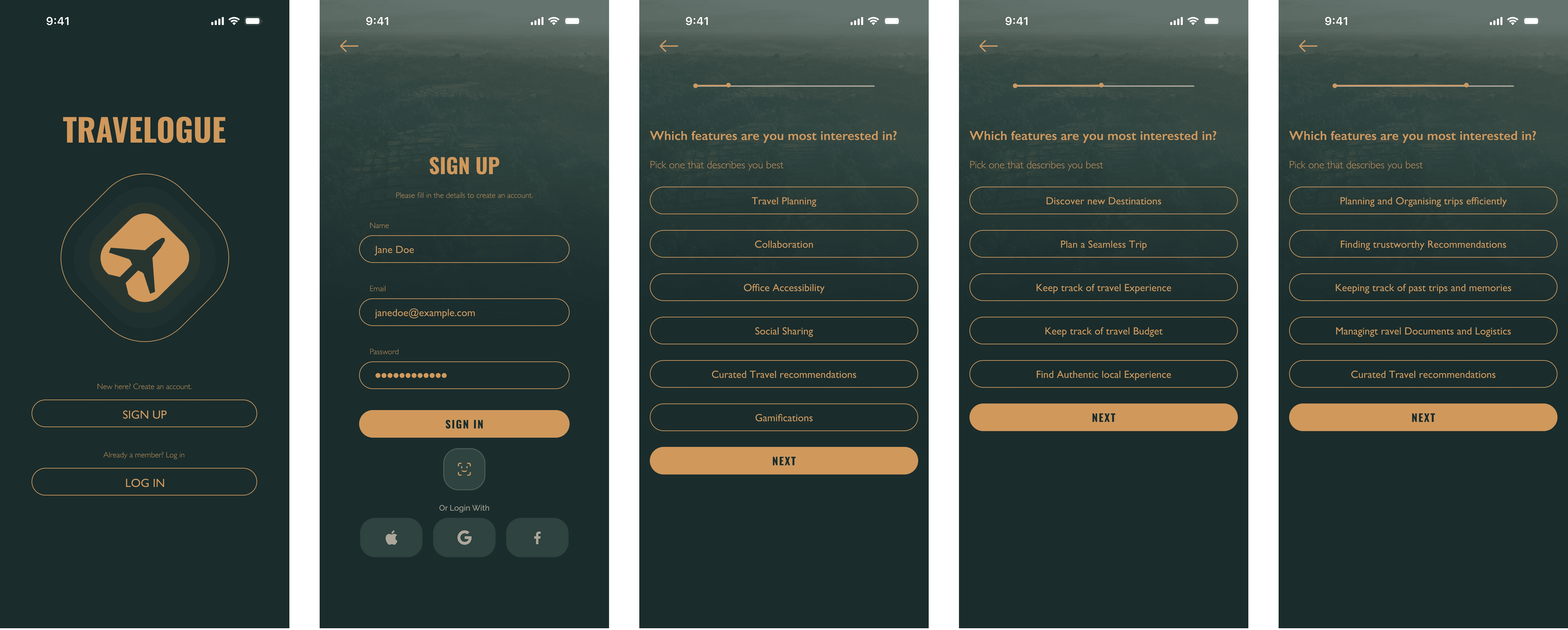
Onboarding in most apps is confusing or impersonal
Whats missing
Current platforms offer isolated features itinerary planning or social storytelling but rarely both. Travelogue identifies this gap and seeks to unify them under one app experience.
Research Process
A mutli-method approach to uncover what real travellers need from a planning app.
User Interviews
11 Participants (Ages 18–35)
We interviewed solo and group travelers to understand planning behaviors and pain points.
Key Finding: People valued collaboration more than gamification.
Card Sorting (Optimal Workshop)
6 Participants
Used open card sorting to categorize features.
Helped us shape primary app sections:
Trip Planning
On-Trip Experience
Explore
Usability Testing
Mid-Fi and Hi-Fi tests with 6 users
We observed user flows, tracked errors, and refined:
Onboarding clarity
Collaboration discoverability
Offline accessibility
Personas
Understanding user behavior and context led to a more meaningful and intuitive smart water experience.
Design Process
Travelogue - A single app to plan, collaborate, and share your journey – online or offline.
Travelogue bridges the gap between travel logistics and memory-making.
It enables collaborative trip planning, real-time itinerary access, offline documentation, and a gentle layer of social gamification — all in one place.
Core Features Overview
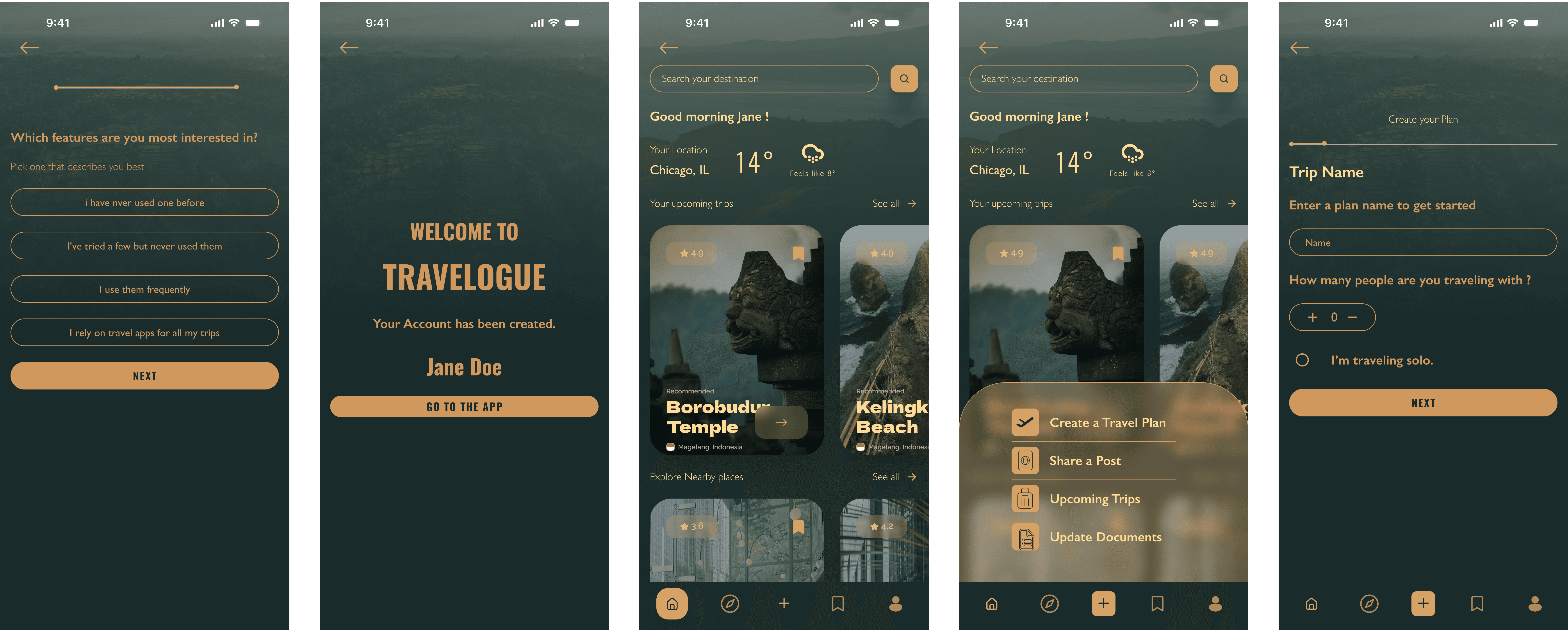
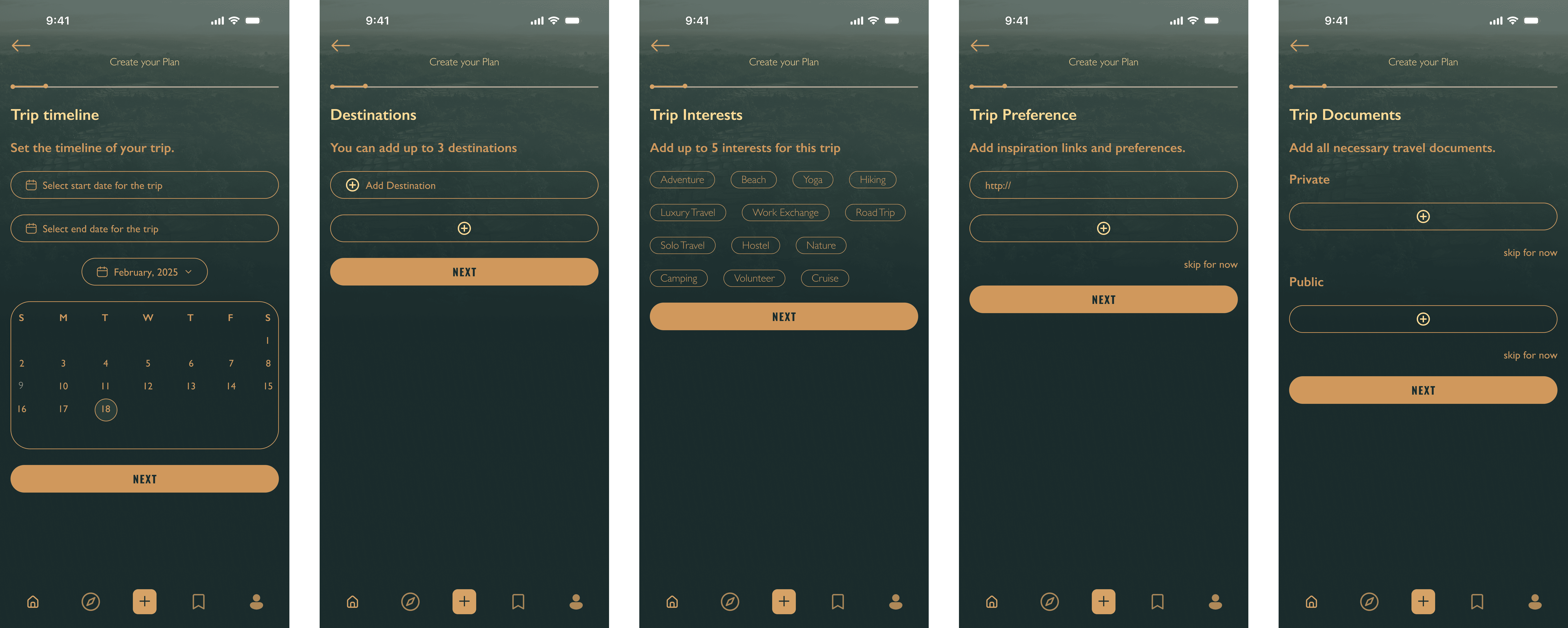
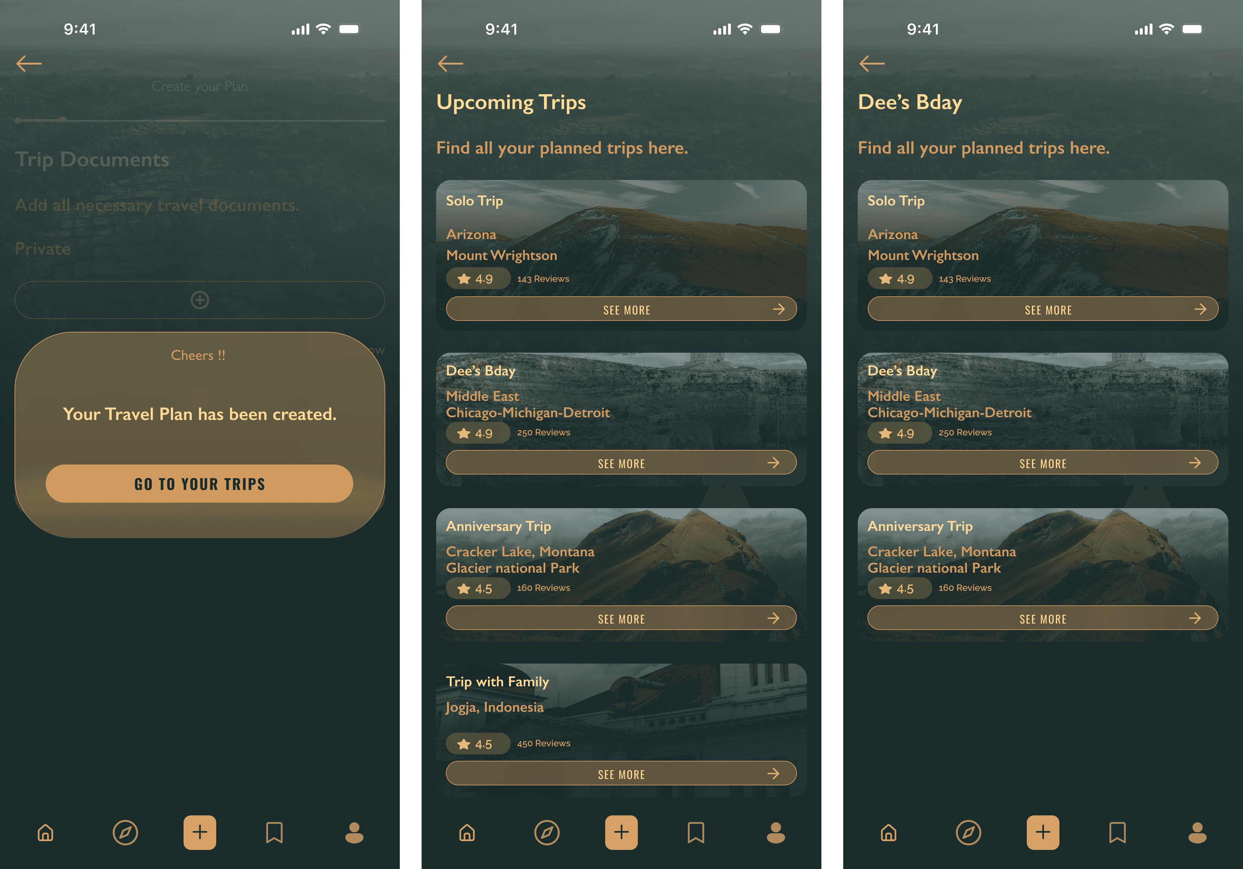
Create solo or group trips
Invite friends to co-edit itineraries
Add destinations, tickets, checklists, and documents
Access everything offline
Capture and share travel stories post-trip
Discover hidden local gems through community recommendations
Problem | Solution |
|---|---|
Fragmented tools | One unified platform for planning + sharing |
Poor collaboration | Group trip editing, shared checklists & docs |
No memory capture | Photo journal + reflection space |
No offline access | Full offline mode toggle per trip |
Confusing onboarding | Simple flow with interest tagging & tooltips |
How Research Shaped Design
Our research wasn’t just a step — it was a continuous driver that shaped the app’s foundation. Insights from interviews, card sorting, and usability testing influenced multiple layers of the product:
Navigation Structure
Card sorting exercises exposed how users mentally grouped features — like distinguishing “Trip Planning” from “On-Trip Experiences.” This clarity led us to restructure the app’s bottom nav bar and content categories to match user logic.Offline-First Experience
Offline access was cited as crucial across interviews. Users traveling abroad or into remote areas needed access to documents, itineraries, and checklists without connectivity. This led to the design of a dedicated “Make Available Offline” toggle per trip.Visual Hierarchy of Features
Users prioritized checklists, travel docs, and itinerary over gamification. We elevated these in the dashboard design, placing core trip planning tools above secondary features like social feed and rewards.Simplified Onboarding with Personalization Hooks
We noticed users were confused about how interest selections impacted their app experience. So we added subtle tooltips and live examples to explain how their choices would personalize suggestions and dashboard widgets.Iterative Refinement Through Usability Testing
Each test led to tangible design changes: improving the visibility of “Invite to Trip,” rewording confusing CTAs, and adjusting iconography to reduce misclicks. Nothing was final until it passed user validation.
Prototypes
Early Concept Mockups
High Fidelity

More projects
Got questions?
I’m always excited to collaborate on innovative and exciting projects!
Copy email
Copied