
Sustainable Living Guide - UI/UX Design Intern (TX,USA)
Multi-Faceted UI/UX Contributions During 6-Month Internship
Date
June 24 - December 24
Service
UX Research, UI/UX Design, Mobile App Design
Project Type
Internship
Overview
Sustainable Living Guide (SLG) is an international platform for regenerative education, climate action, and eco-conscious living. It provides online classes, global programs, and sustainability toolkits to empower community wellbeing.
Ecological Music Alliance (EMA), a sub-brand of SLG, celebrates the synergy between music, healing, and the environment.
During my 6-month internship
(June - November 2024), I contributed to both SLG and EMA, redesigning web components that spanned homepage layouts, educational rows, and visual framework.
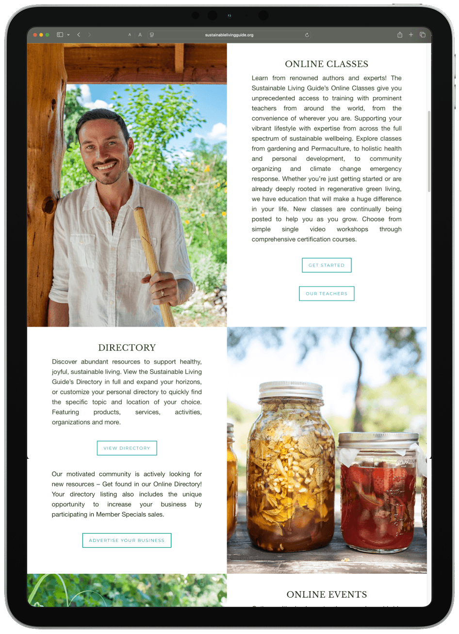
Redesigning Homepage
Travel planning today is scattered, inefficient, and lacks a human-centered design approach.
The original SLG homepage presented a dense set of offerings without clear visual hierarchy. CTAs blended into content blocks, and row sections felt unbalanced. It lacked guidance for users unfamiliar with the platform’s breadth. My focus was on introducing rhythm, spacing, and typographic priority.
Redesigning Elements
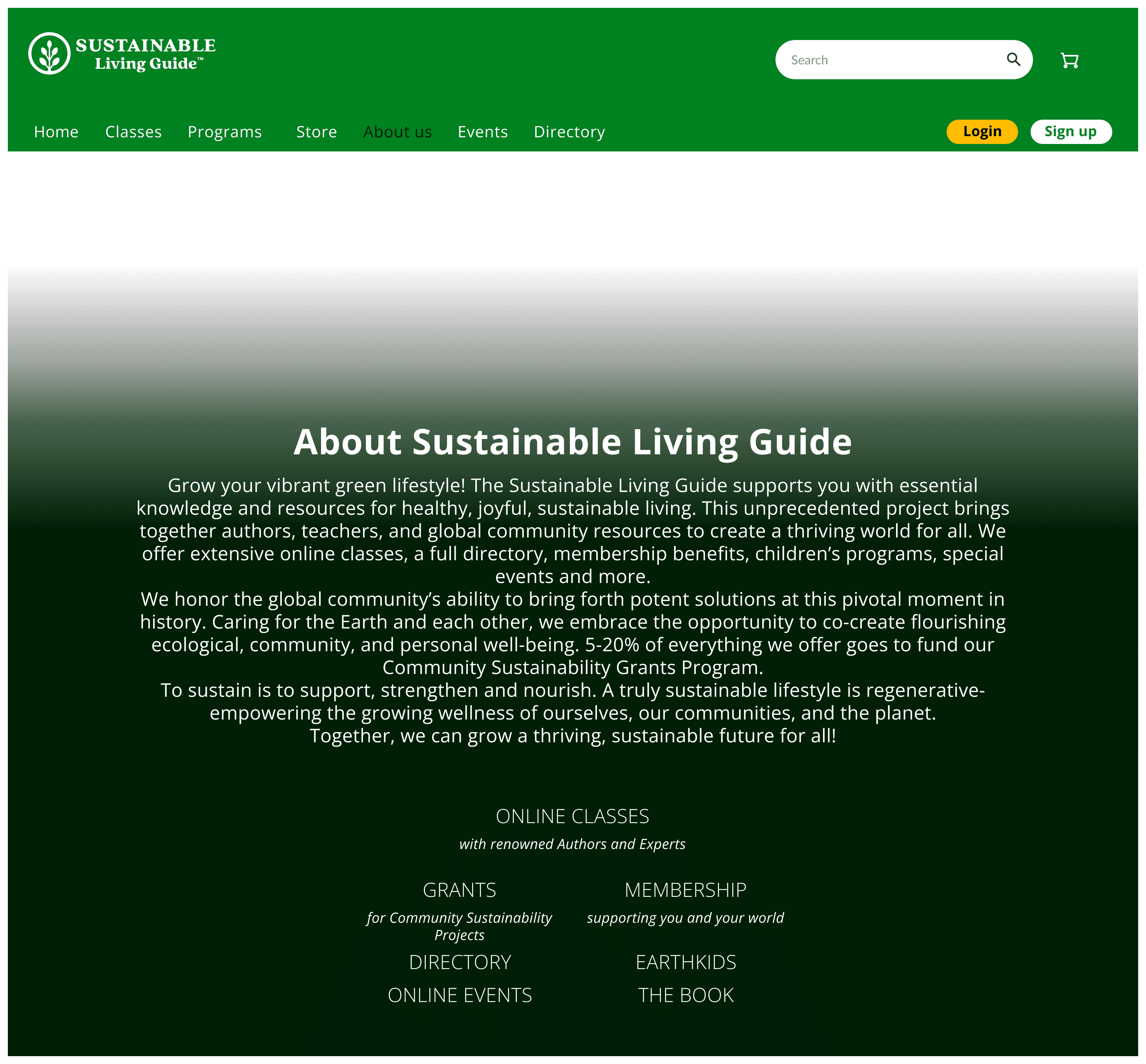
About Us Section – Layout & Design Rationale
This section was thoughtfully designed to establish visual breathing space between the primary site header and the core content, creating a clean transition zone for upcoming homepage elements. The generous padding above the "About Us" heading ensures the user’s eye naturally flows from the hero section downwards without visual congestion.
A centered layout grounds the block, emphasizing its importance while maintaining harmony with the site's grid system.
Typography follows SLG's web guidelines — using bold Open Sans headers with sufficient contrast and hierarchy over body text. Balanced white space around the text box supports readability while visually framing the content within the page’s bookend structure. The overall tone remains open, welcoming, and aligned with SLG’s regenerative and community-first ethos.
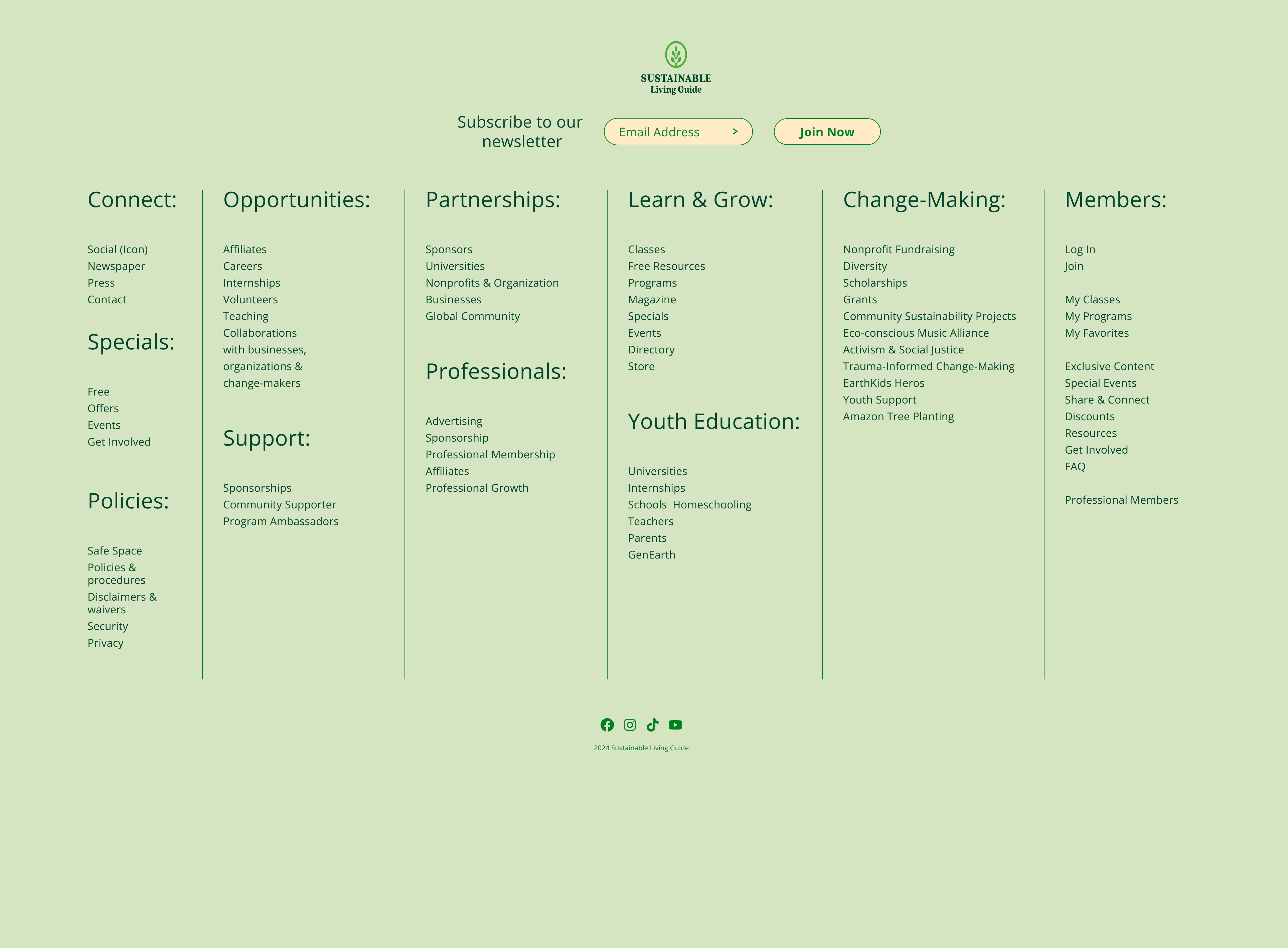
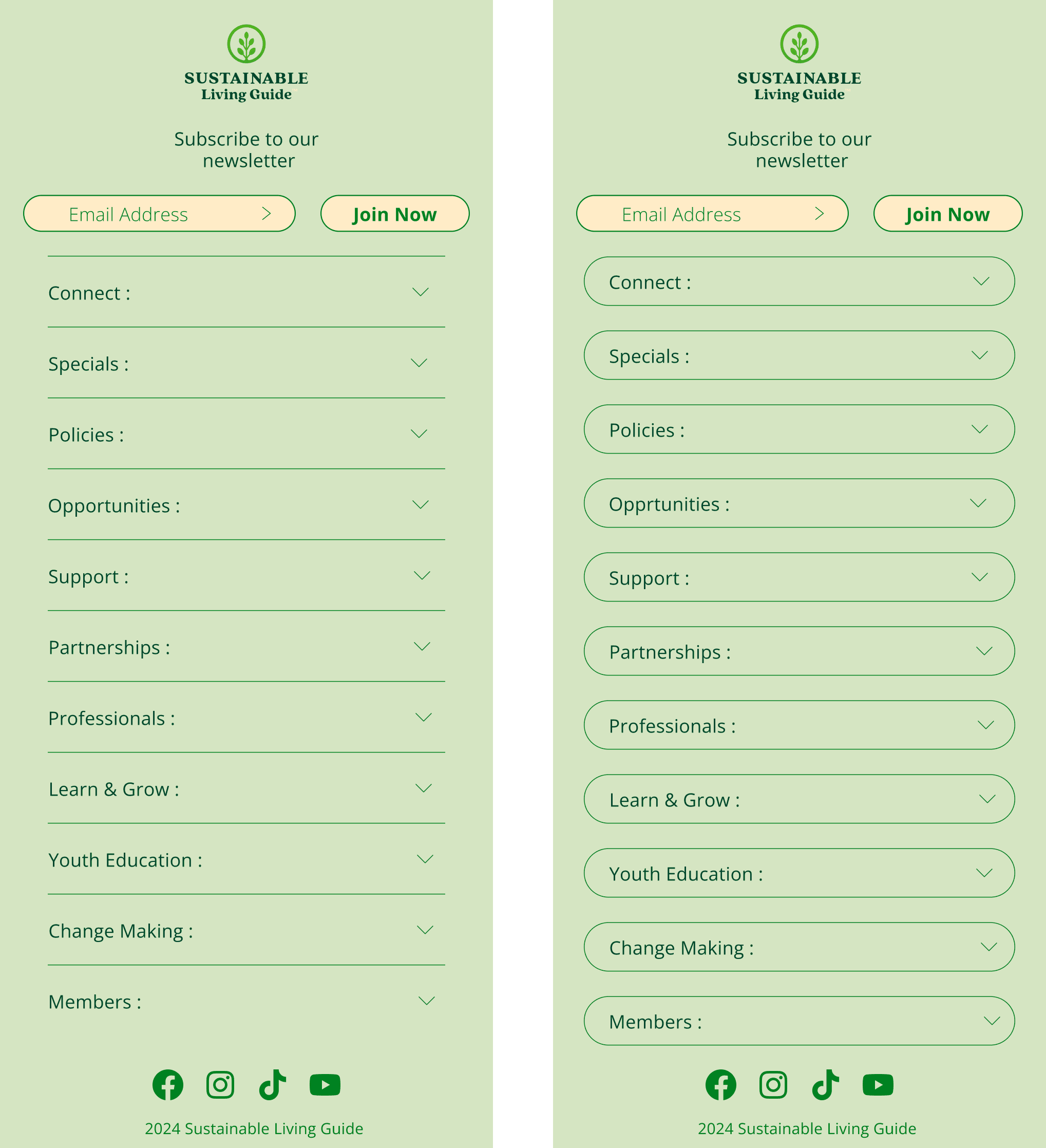
Footer Design – Desktop & Mobile Adaptation
The SLG footer was designed with a focus on scalability, accessibility, and structured clarity across screen sizes. On desktop, the footer uses a multi-column grid layout to organize expansive content under clearly labeled categories such as Connect, Opportunities, Learn & Grow, and more. This wide layout utilizes the full screen width, promoting quick scanning while maintaining visual balance through consistent padding and vertical alignment.
The mobile version reflows this content into a stacked accordion layout, optimizing for touch interaction and readability on small screens. Rounded input fields and buttons follow brand styling, while collapsible sections reduce visual clutter and support progressive disclosure of information. The email signup and logo remain top-aligned for consistent brand recall across devices.
Visual hierarchy is established through larger bold headers, uniform spacing, and soft green background hues from SLG’s brand palette. The footer reinforces navigation continuity, encourages newsletter engagement, and provides easy access to social links all while staying responsive and clean.
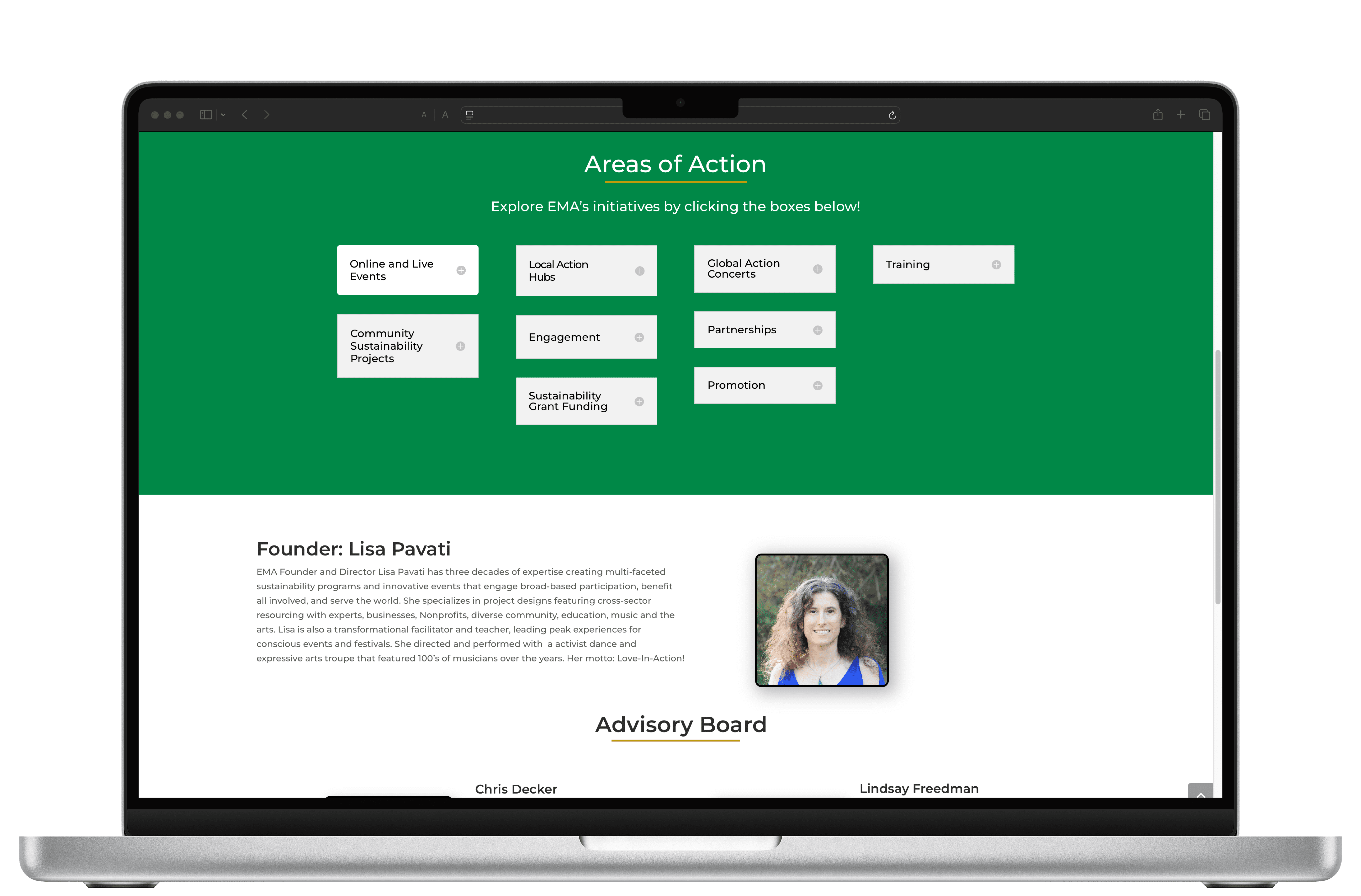
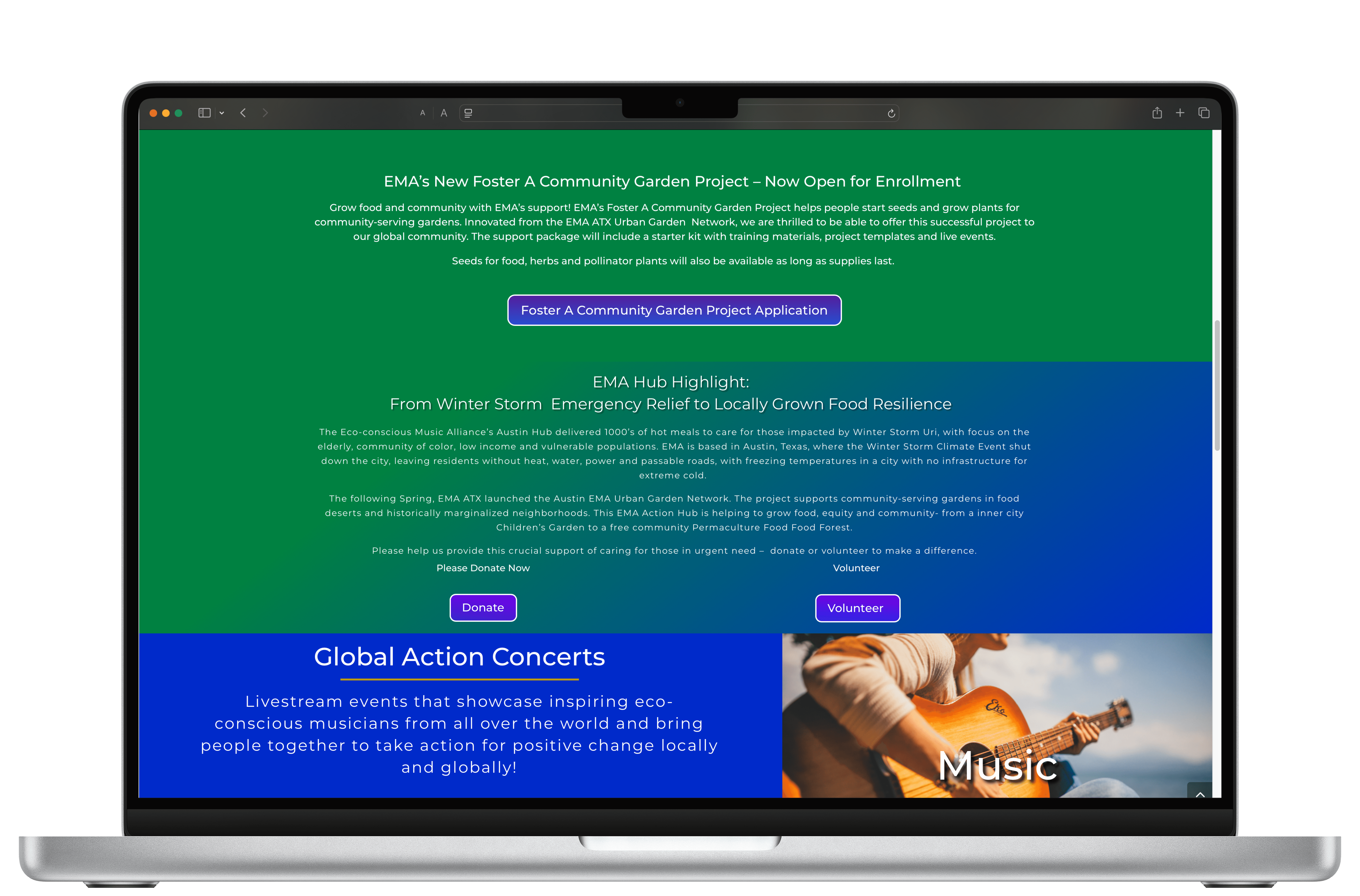
Redesigning EMA Homepage
EMA’s Unique-but-Coherent Identity
Ecological Music Alliance (EMA) needed to look distinct from SLG while visually signaling it belonged under the same umbrella. I helped create rows and section designs that balanced the creative energy of music with SLG’s clean, nature-driven aesthetic — all while applying consistent UI rules.
Redesigning Elements for EMA
Header
Design Objective:
The EMA header was designed to clearly differentiate user types (Individuals vs. Businesses) while maintaining streamlined navigation and access points.
Key Details:
Dual-tier structure: The top tier targets user segmentation (Individuals | Businesses) and key CTAs (Login, Sign Up, Donate).
Navigation clarity: The lower tier holds primary navigation links in a clean, center-aligned grid using the brand's green and white identity.
Hierarchy & contrast: High contrast between sections helps guide user attention, with the Donate CTA styled as a pill button to draw action.

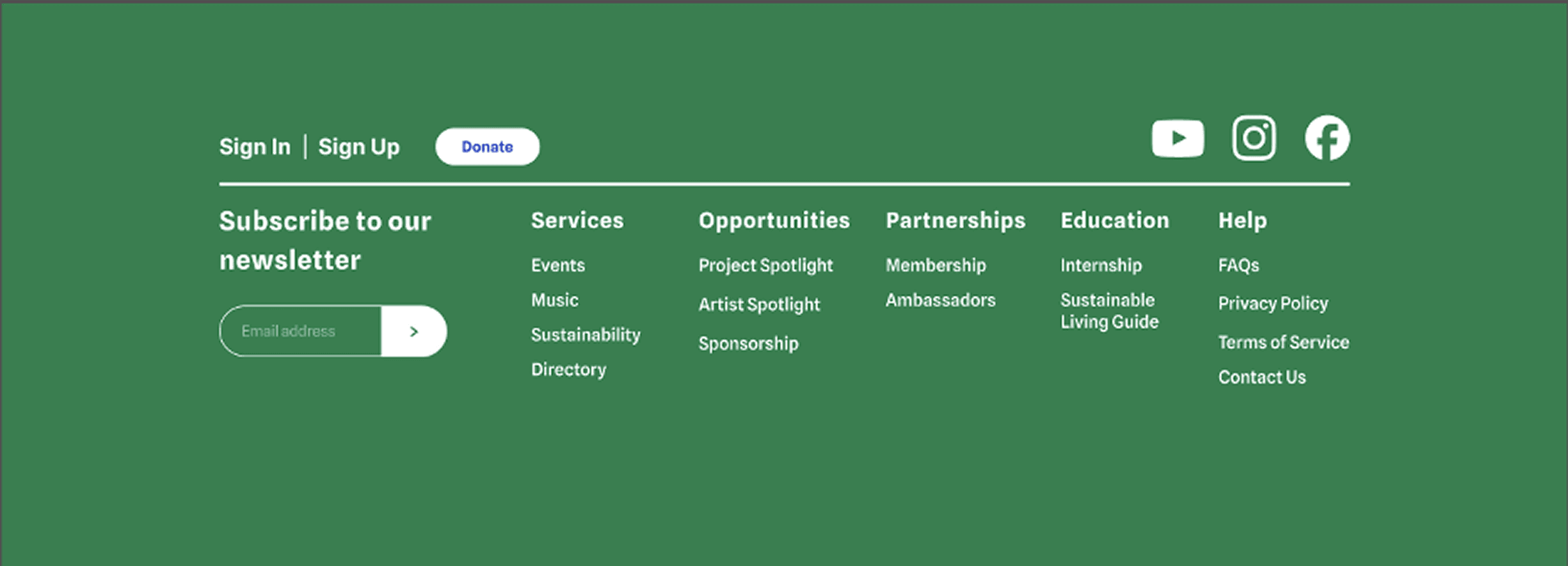
Footer
Design Objective:
Create a responsive, well-organized footer that offers both utility and continuity with brand identity.
Key Details:
Multi-column layout: Categorized into key service areas—Services, Opportunities, Partnerships, Education, Help—for quick navigation.
Newsletter integration: A prominent subscription input reinforces user engagement and retention.
Visual consistency: Brand green background paired with white text and consistent padding maintains readability and elegance.
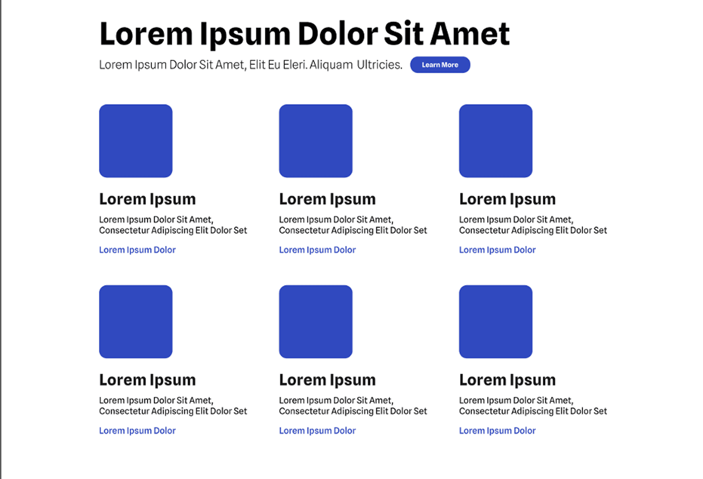
Events Page – Option 01 (Grid View)
Design Objective:
Present multiple events in a uniform card layout for visual scalability and quick exploration.
Key Details:
Card-based grid: Symmetrical grid holds image placeholders, headings, descriptions, and links.
Scannable structure: Clean hierarchy using bold headings and subtle paragraph spacing.
CTA standardization: "Learn More" buttons consistently placed below ensure interaction predictability.
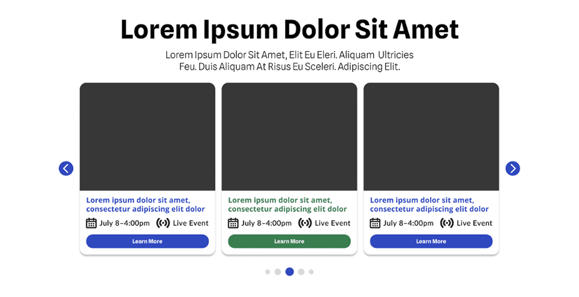
Events Page – Option 02 (Carousel View)
Design Objective:
Provide a dynamic, interactive event experience with visual hierarchy and key event metadata.
Key Details:
Carousel interaction: Allows horizontal scrolling through events while maintaining focus on each card.
Event metadata: Date, time, and live status are visually supported with icons for fast scanning.
Highlighting urgency: Subtle color variation (e.g., green for active/live) adds status cues without overpowering.
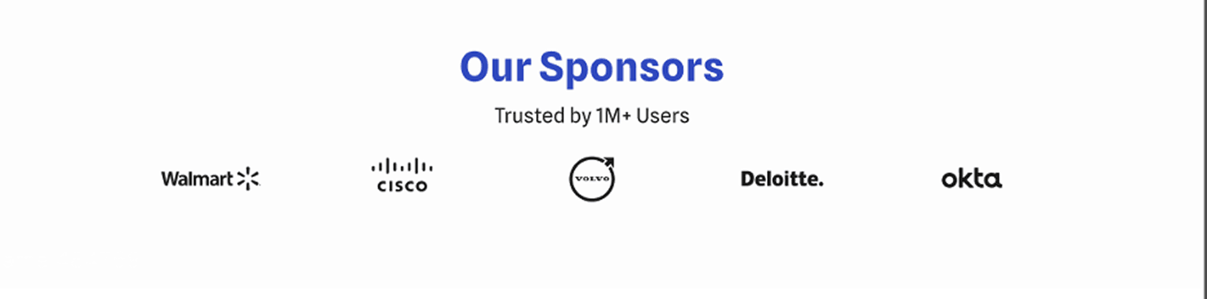
Sponsor Section
Design Objective:
Establish brand trust and social proof with a minimal, modern sponsor strip.
Key Details:
Centered layout: Headline and trust statement are centrally aligned for balance.
Greyscale logos: Corporate logos are shown in black/white to maintain visual harmony and avoid brand clashes.
White space usage: Generous spacing between elements contributes to a clean, professional feel.
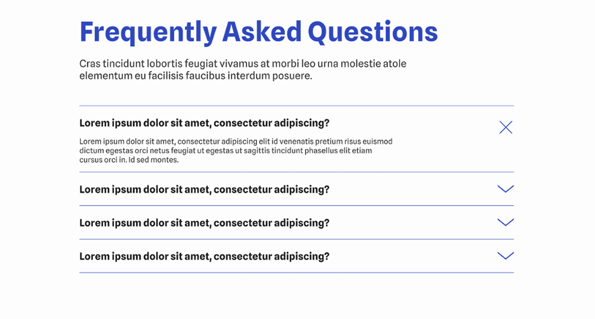
FAQ Section
Design Objective:
Create an accessible and approachable FAQ interface with expandable answers.
Key Details:
Accordion layout: Allows progressive disclosure, reducing cognitive load.
Typography emphasis: Questions are bold and visually dominant; answers use lighter weight for distinction.
Line anchors: Underlines and directional icons provide visual structure while guiding user interaction.
More projects
Got questions?
I’m always excited to collaborate on innovative and exciting projects!
Copy email
Copied